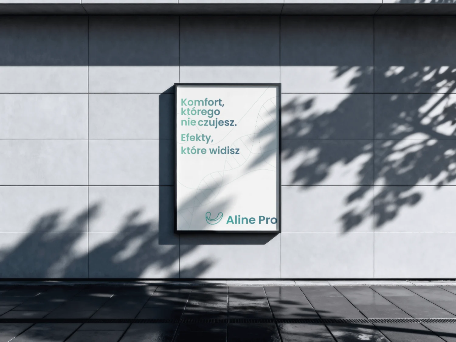
BUILDING A VISUAL IDENTITY OF TRUST AND PRECISION.
LOGO DESIGN
COLOR SYSTEM
TYPOGRAPHY
PRINT COLLATERAL
BRAND GUIDELINES
The Mission
To position Aline Pro as the most modern, technologically-advanced, and trusted B2B partner for orthodontists across Europe.
The Design Goal
1. Create a logo reflecting precision and flexibility.
2. Define a color palette that builds trust (medical, tech).
3. Develop a scalable system for web and print.
5
+
Print Materials
4
Target Personas
2
+
Primary Colors
10
+
Logo Variations
"The new logo and colors perfectly capture our vision of precision and trust. We finally look like the market leaders we are."
Szymon K. Co-founder of Aline Pro
Core Identity Assets
Logo
A unique logomark was designed, combining a fluid "A" with the shape of an aligner to represent flexibility and precision.
Logo
Primary Color Palette
A palette of Aqua (
#7BC8B6) and Steel Blue (#466F86) was chosen to build a sense of medical trust, technology, and premium quality.Primary Color Palette
Typography System
A clean, modern typography pairing was established to ensure high readability and a consistent brand voice across web and print.
Typography System
Brand Slogans
A set of key slogans, including "Europe's Premium Manufacturer of Clear Aligners," was crafted to define the brand's market position.
Brand Slogans
Print Materials
The brand identity was extended to print-ready assets, including professional flyers and letterheads, ensuring brand consistency offline.
Print Materials
Tech Stack
Illustrator
Figma
Photoshop
In Design

.webp)
.webp)

